NEXT global real estate office
My capstone interior for a fictional real-estate firm: reception, meeting rooms, private offices, and a breakroom organized around a single material story.

Reception — establishing view
Brief
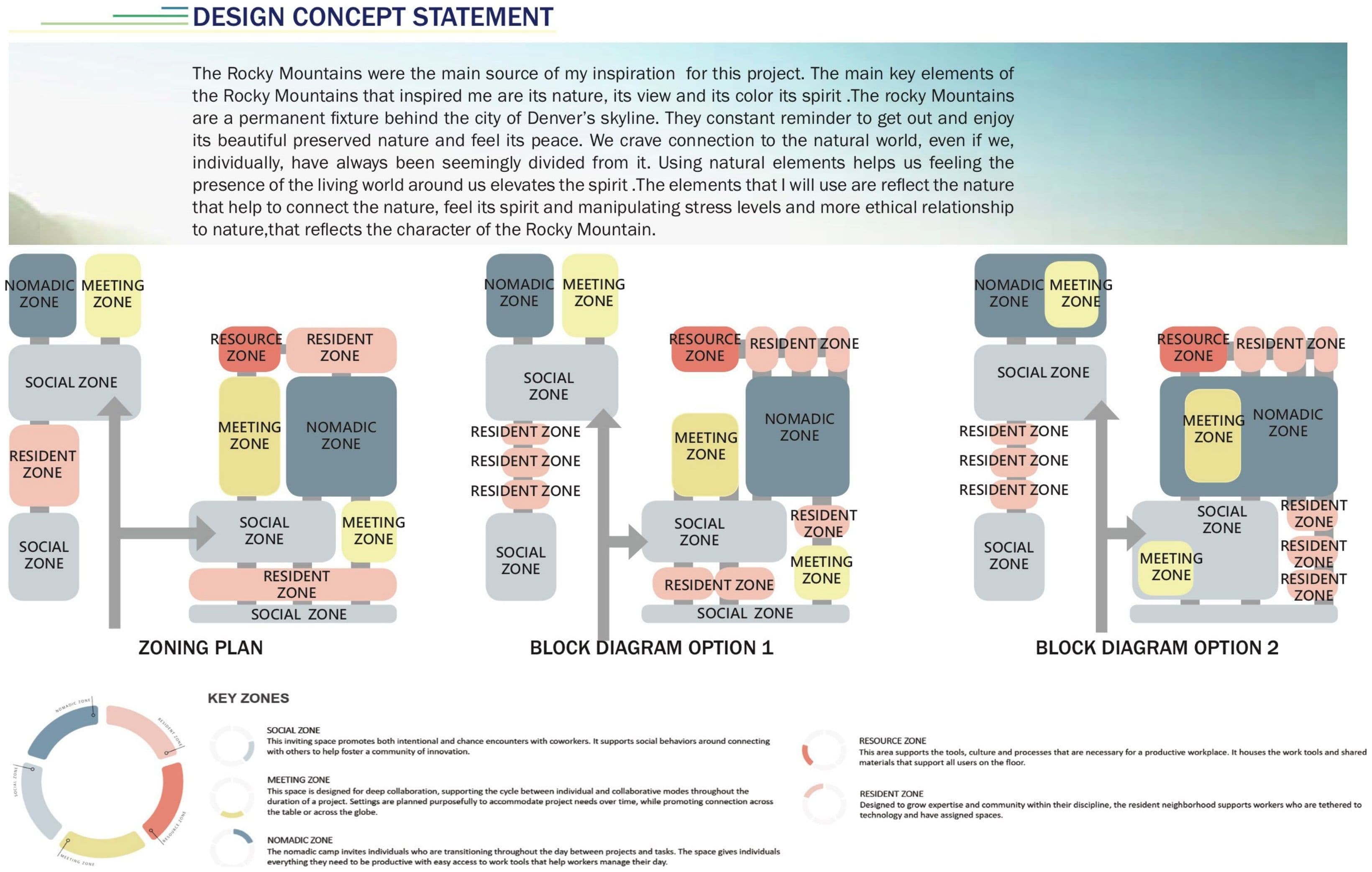
The capstone brief in my final studio at Mesa College asked for a commercial interior at the scale of a working office: a global real-estate firm called NEXT, with reception, conference space, private offices for the principals, and a breakroom that the staff would actually use. The studio prompt set the program. My design problem was to take a typology I hadn't yet worked at full scale (open-plan commercial, not residential) and resolve it in plan, in materials, and in a presentation set thorough enough to defend.
This is the only commercial project in my academic portfolio. Everything else from my Mesa years (Sep 2015 – Jan 2019) is residential. I kept it after years of professional work because it is the piece that proved I could program a non-residential floor plate from scratch.
Plan
The plan opens at reception. A long counter takes the first sightline from the entry, with a seating area held to one side rather than parked in the middle of the room, so visitors are read first and then asked to sit. Behind reception the floor splits: conference rooms along one edge for client meetings, private offices along the other for the principals, and the breakroom pushed to the back of the plate where it can carry noise without crossing the meeting circulation.
The conference rooms are glazed to the corridor. The private offices are not. That decision drove the rest of the plan: meetings stay legible from the public side of the office, principals stay heads-down on the other.
I drew the axonometric to read the whole plate at once: walls dropped to waist height, furniture and fixtures shown in place, the circulation between reception, conference, and private offices visible without flipping between sheets. That drawing made the plan defensible in review.
Material story
My aesthetic decision was contemporary corporate carried by a single saturated accent: a clear blue picked up in the lounge upholstery, the work-cafe stools, and a feature wall in the breakroom. Around the accent the palette stays light: pale flooring, white walls, and modular pod seating in soft greys for the focus zones. The pods themselves are part of the program, not just furniture. They give the open plate the small enclosed rooms a working office actually needs without committing the floor plan to permanent walls.
I wanted the design legible at every scale: the colour you read from the entry, the material you touch at the desk, the surface that holds up to a meeting. One accent, one warm-cool relationship across the wood, the metal, and the upholstery, and a willingness to leave the rest quiet.
What it taught
Three things stayed with me after graduation. First, scale. A commercial floor plate forces decisions about circulation and acoustics that a single-family kitchen does not, and the only way to learn that is to draw one. Second, programming a typology I hadn't lived in: figuring out where a real-estate principal needs privacy, where the staff need adjacency, and where clients need to be received versus seated. Third, the presentation set. The axonometric, the finish board, and the rendered interiors had to carry the project through a final review without me in the room to narrate them.
I built the renderings in SketchUp and finished them in Podium. The tools were the studio standard at the time; the value of the project wasn't the render engine but the discipline of resolving a commercial program down to a set of drawings a stranger could read.
I keep this in the portfolio because it is the only academic project where I programmed a non-residential floor plate and resolved it as a full presentation set.
Floor plan 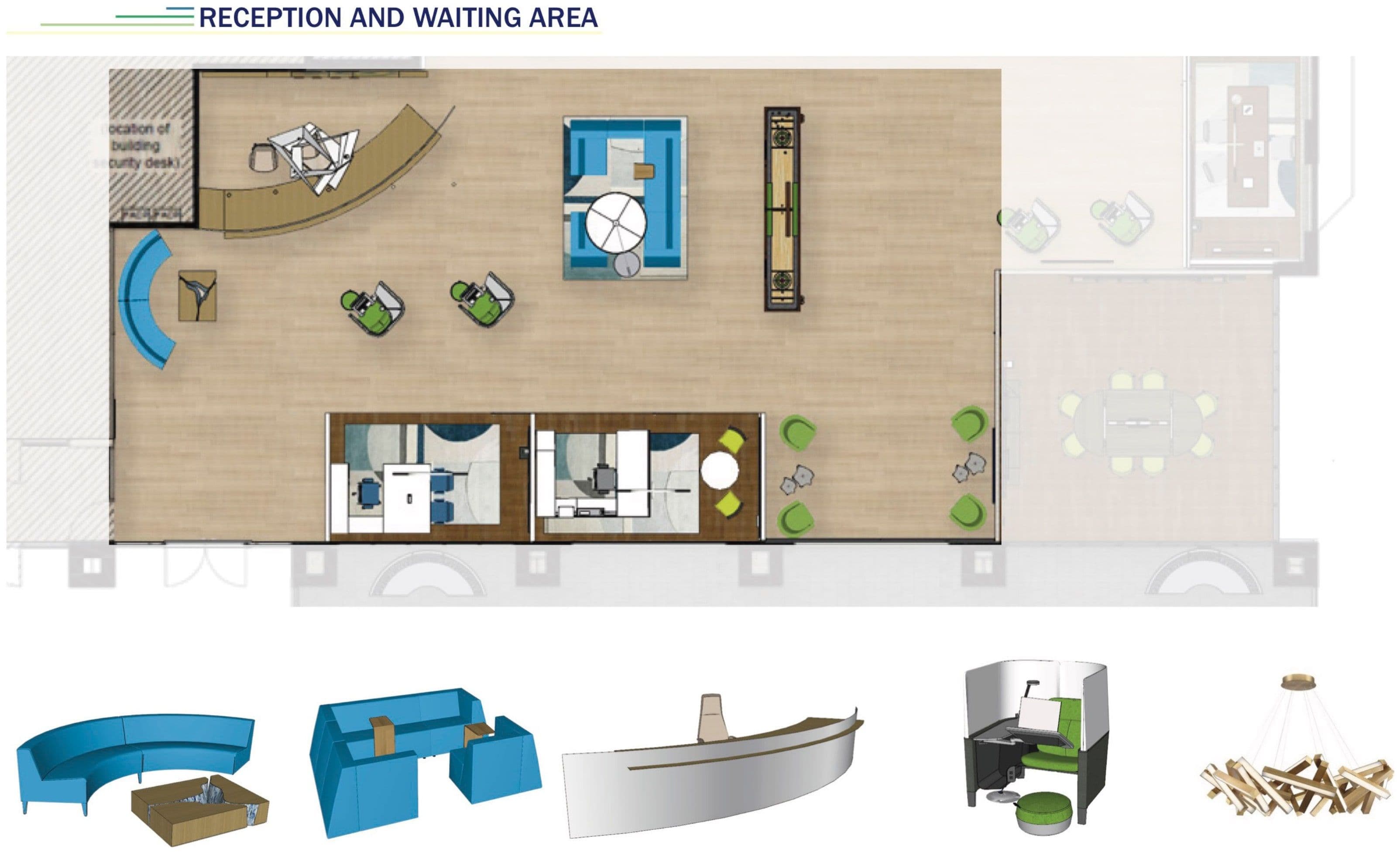
Conference room 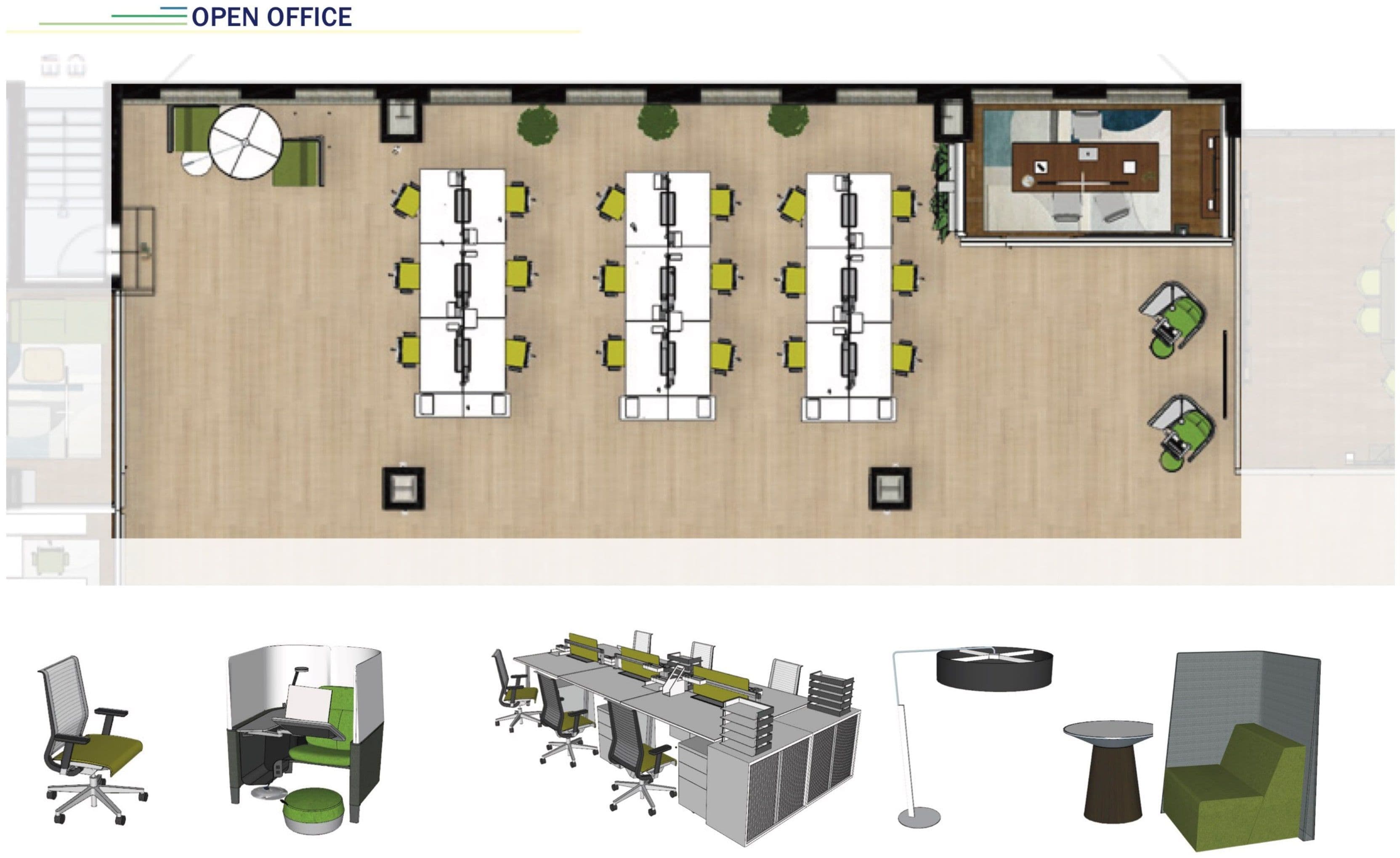
Private office 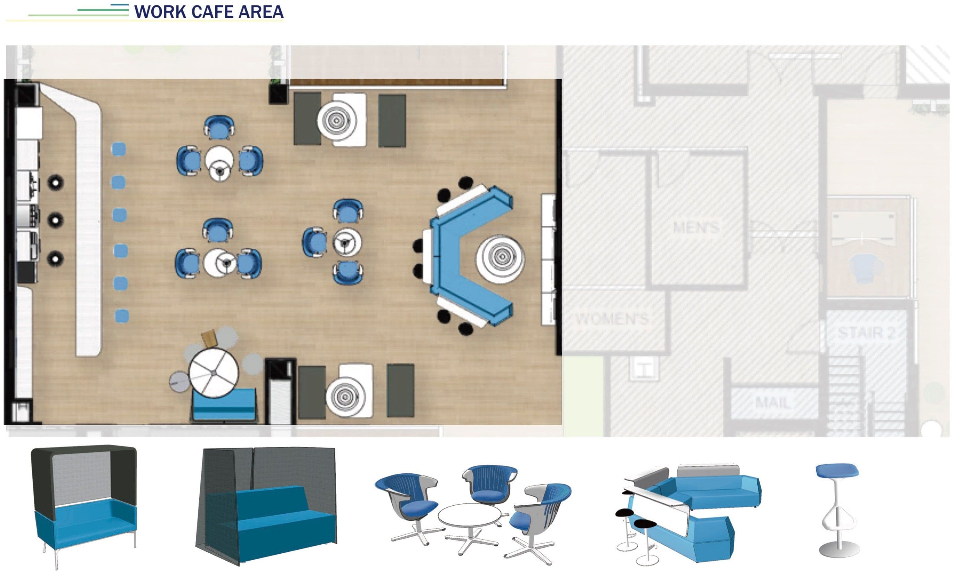
Breakroom 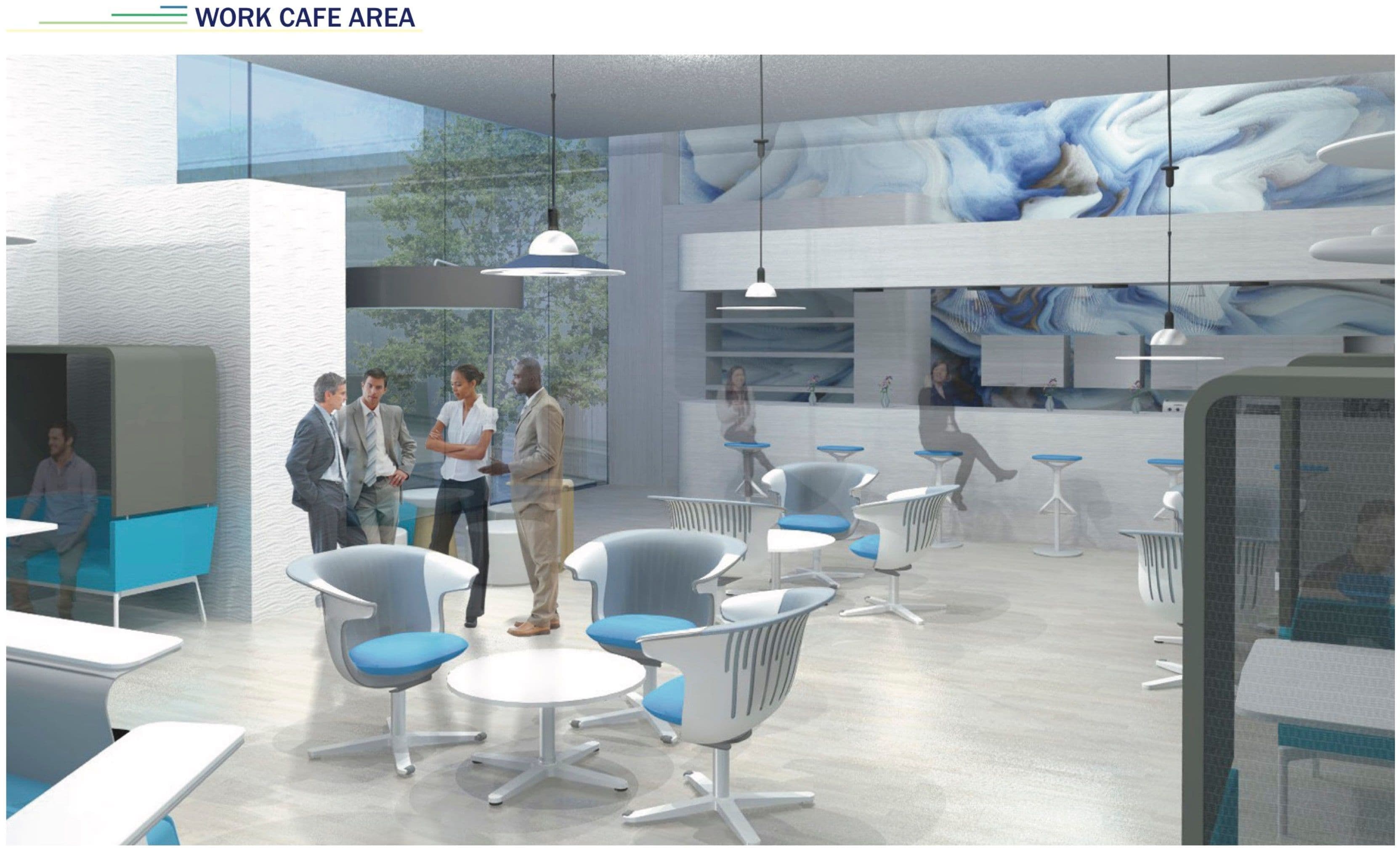
Work cafe — accent room 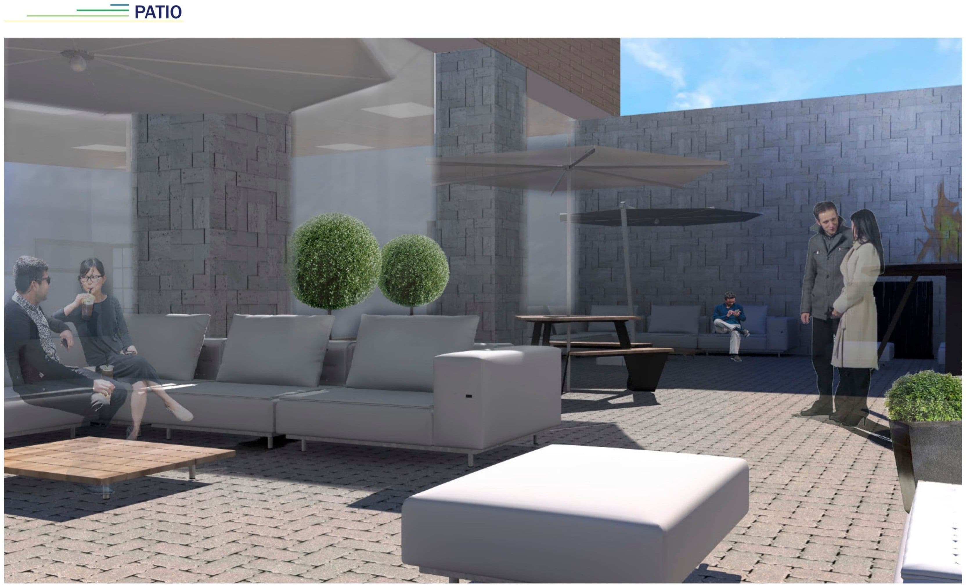
Axonometric