Buffalo art gallery
A small-scale art-gallery interior I modelled in Revit. Plan, section, materials composition, and a rendered gallery view.
Main gallery — interior view
Brief
The capstone for the Revit segment of my coursework was a small-scale art gallery: a non-residential typology, modelled end-to-end in a single tool. The brief was academic: a building that had to hold circulation, daylight, and finish decisions together at the scale of a public room, then be drawn well enough to read.
Gallery typology was the point. After a sequence of residential exercises, the program asked for a building whose plan is organised around movement past objects rather than around occupancy of rooms. Walls function as hang surfaces and doors function as thresholds between them, so the plan has to carry the program a residential typology never asks it to.
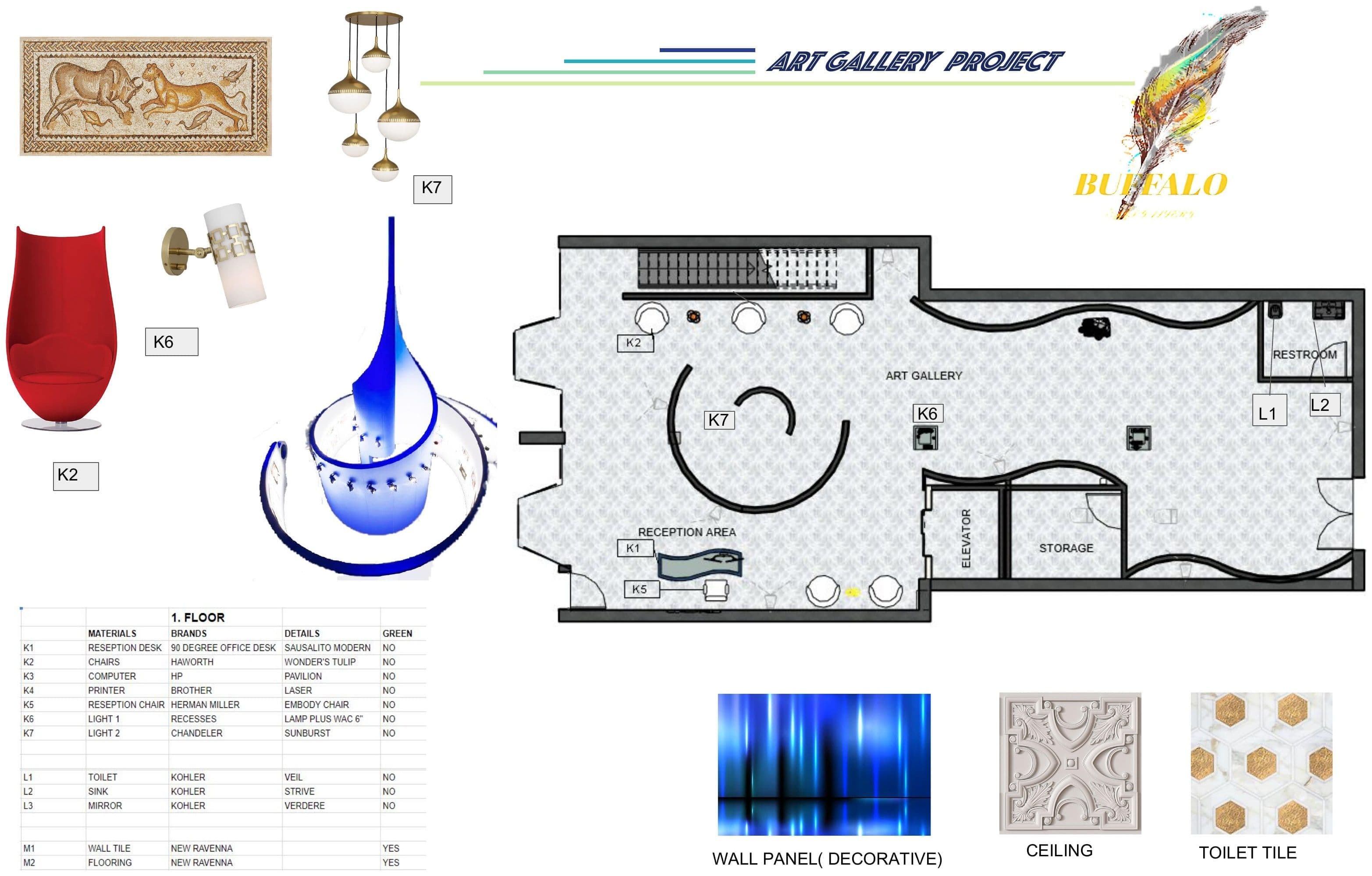
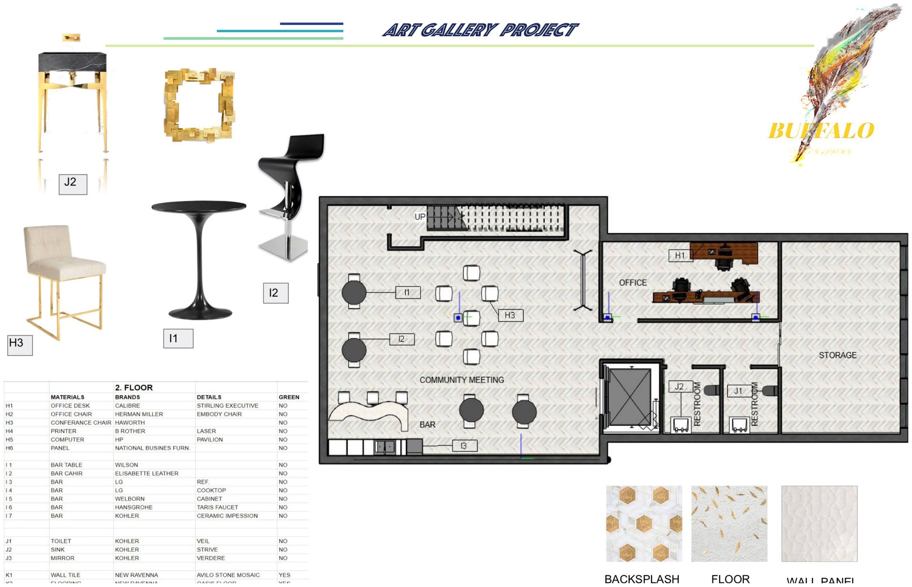
Plan
The floor plan is the strongest sheet in my set. Circulation reads as the controlling decision: a single guided route loops visitors through the gallery's display walls and returns them to the entry, with the back-of-house and service spaces held to one edge so they don't interrupt the loop. The hang surfaces are continuous along the route; the breaks in the wall line are where the next view opens.
I drew furniture and partition placement at the same line weight as the structure, which is what gives the plan its composition. Nothing on the sheet is decoration. Every element is either a wall a visitor walks past or a wall a piece hangs on.
Section
What the plan can't show, the building section does. The section cuts through the main gallery volume and records the ceiling height the plan only implies: a taller room than the back-of-house spaces around it, with the ceiling lifted to give the hang walls headroom and to let the overhead light fixtures sit clear of the sightline. The change in ceiling plane between the gallery and the support spaces is the section's quiet argument for where the public room begins.
Materials
The materials and finish composition is a board, not a specification: warm wood tones for the floor, neutral wall finishes that read as paintable hang surface, stone or concrete on the threshold and service zones. I kept the selection restrained because gallery walls have to recede so the work on them can be seen. The board is composed rather than enumerated, and is best understood as a study in palette, not a procurement list.
Why it mattered
This was the project where I had to demonstrate Revit on a building that wasn't a house. Walls had to be modelled as hang surfaces; ceilings had to carry a section; the plan had to compose at gallery scale. The interior rendering is the weakest sheet (it shows the room but not yet the light), and I'm honest about that. The plan and section are where the training reads, and they are why I keep the capstone in the portfolio.
Plan & circulation 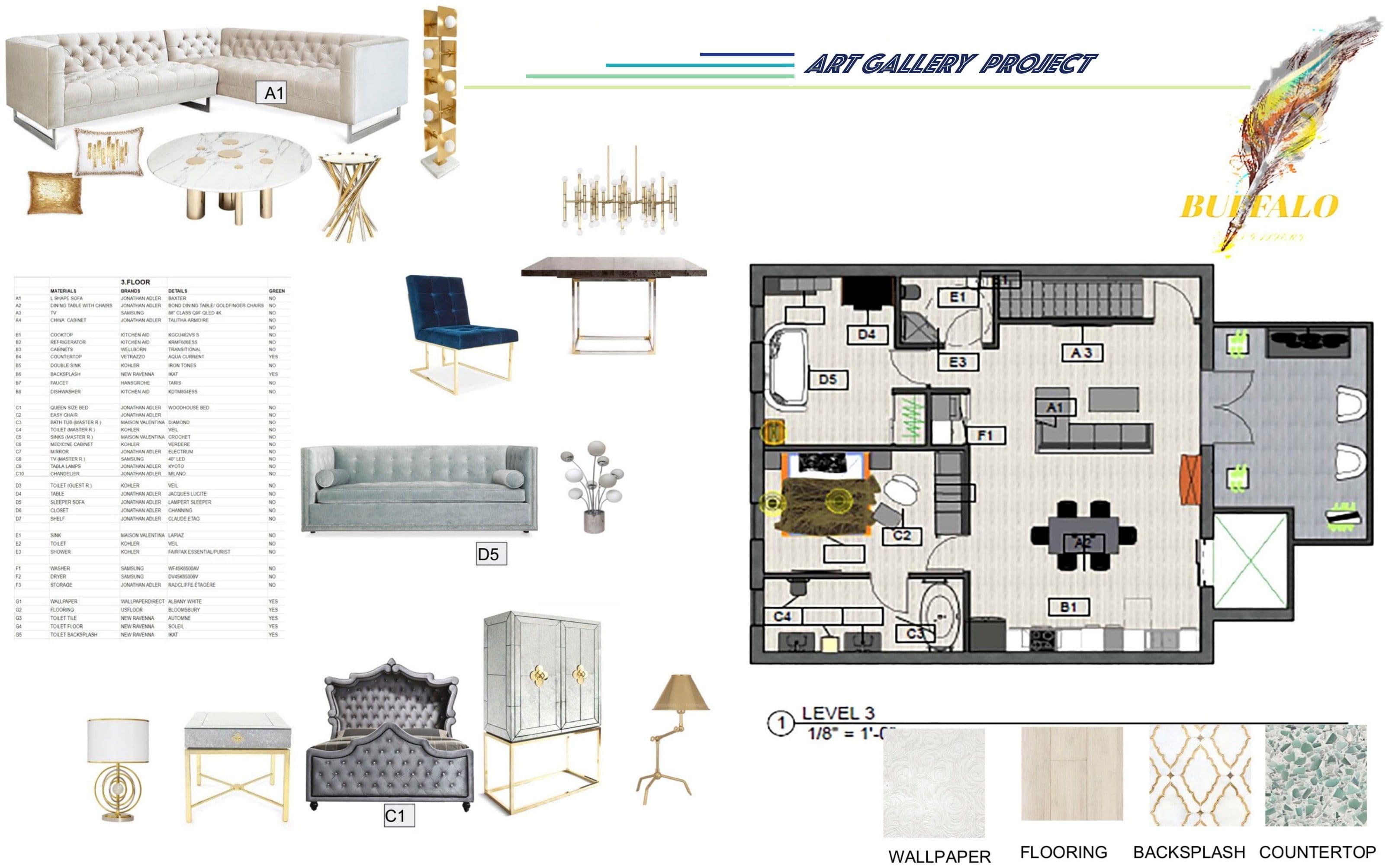
Materials & finishes 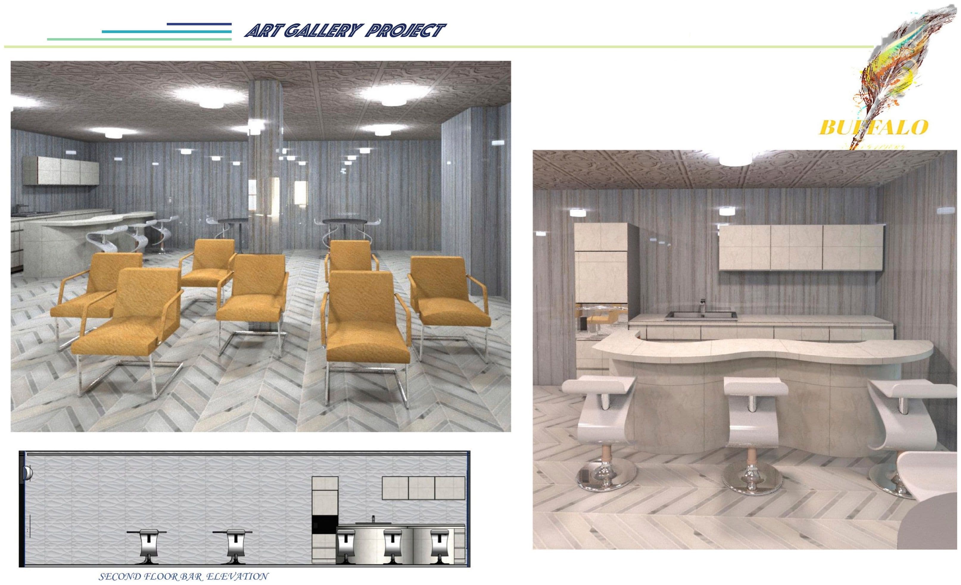
Building section